Lately I’ve been testing some tools to help better understand the often large amounts of data that I source from. I live in spreadsheets and while I can pivot, slice, and plot data in excel well, sometimes I need a purpose-built data tool to see the underlying context. After testing enterprise-level platforms that were overkill for my needs, I found silk.co and I wanted to share the joy.
Silk.co bills itself as a place to publish data with interactive visualizations. This free tool was originally marketed as a great way for reporters and causes to share datasets. Unlike Tableau ($500-999 per user), Silk is currently free with the option for private, collaborative projects for teams. They also include user rights management and good privacy settings all in a platform with a lighter learning curve.
As an example, I created this public project with members from a Docker Meetup group in NYC. I’ve always had issues dealing with Meetup groups, as location is not actually a requirement to join a group.
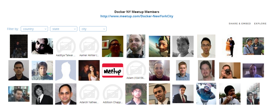
First, I created a Mosaic with thumbnail image links and data that I pulled using the Meetups API. It’s possible to use the filters on the left to dig into the dataset.
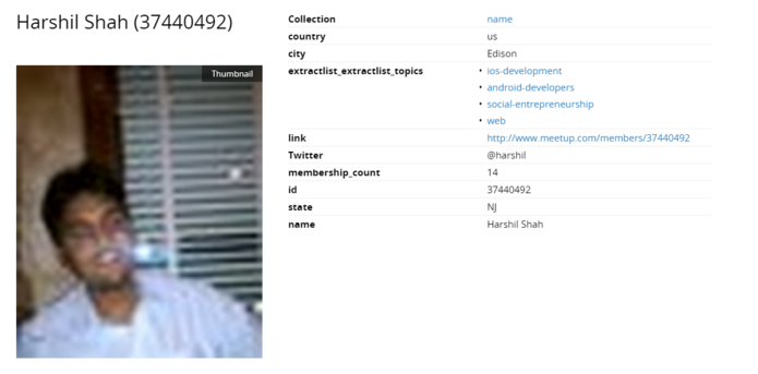
 Clicking on any profile picture will bring up their “Datacard” with their profile link, Twitter ID (if listed in profile), yotal # of groups they are member of, and other topics of interests. Here is Harshil’s public meetup profile for reference.

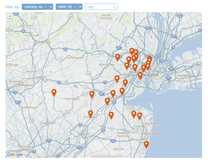
Back on the homepage below the Mosaic, I created a map using Google’s natural language system. In this case, they are pulling the city/state combination from the profile. While Meetup does have longitude and latitude API data, this is generated from the same city/state data the user enters so no real benefit. You can pick which data points are shown in the mini-datacard preview when you click on each pin. If you have more than one person per city, you can drill-down without leaving the page.
Mapping proved to be the most useful tool for my sourcing needs. I was able to hone in on the people who live nearby and compare that to their hometown. Any good recruiter will tell you that someone who has never left home is unlikely to move for even the ideal position. Context from their Interests and biography helped me craft personalized outreach messages.

Near the bottom of the page I added a stack chart to show membership counts to get a sense of their activity on Meetup. Then, I added a few easy to embed multimedia from other sources to help illustrate how silk can be used in other ways.
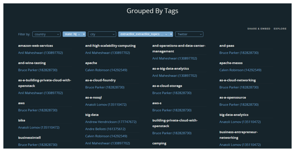
Finally, I decided playing with the interests tags some more by creating a new page (that one was getting long). Using the same dataset, I grouped names by Interest only with additional filters.
Here I have filtered only group members interested in openstack who live in New Jersey. I didn’t want to complicate this example so I can only select one specific topic at a time, and you will see duplicate names (showing results sorted by their other Interests).

I’ve already found several uses for Silk.co in my sourcing workflow and their team has been responsive to my questions. Their technology roadmap includes direct integration with Import.io and automatic updates from Google Sheets. Anyone having a difficult time dealing with large spreadsheets should take silk for a test drive before investing in more complex solutions to data overload.
