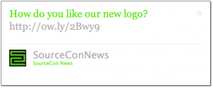
It’s time we updated the look and feel of SourceCon.com, wouldn’t you agree? Well, we thought so. So we started with a new logo:

And.. the black background for more of an element of ‘mystery’…

You may have already noticed this new logo over on our Twitter account (@SourceConNews) where we quietly changed our icon and profile page yesterday to the new logo above.

We also made changes to our Facebook page as well as our LinkedIn group. We wanted to modernize the original logo while paying respect to SourceCon’s beginnings with the maze. What do you think of it?
We of course will be updating the website itself over the coming weeks. We’ll roll the new site out all at once so you won’t notice any little tweaks or anything until we’ve got all our T’s crossed and our I’s dotted. We’ll let you know when we are ready to do this.
That being said, we would love to hear your suggestions as to how we can make SourceCon.com better. Please share any thoughts on how we can improve the site in the comments below. Suggestions we’d love to hear from you include:
- Which complementary colors to use
- Content & features
- Interactive items to include
- Layout / design suggestions
- Anything else you’d like to share
We look forward to continuing to bring you interesting and relevant information as usual – but with a shiny new coat of paint. And – we hope to see you in a few weeks at SourceCon Fall 2010 in Washington, D.C.!